Vinopolis
Wine labels designed for a local store and handler
Brief
Design labels for low selling wines, bought directly from vineyards and repackaged
Disciplines
Concept, photography, graphic design, illustration, packaging design
Design labels for low selling wines, bought directly from vineyards and repackaged
Disciplines
Concept, photography, graphic design, illustration, packaging design
Vinopolis, a local Augsburger wine store and handler, buys stocks of wine that didn't sell well and repackages it to give it a different appeal. We were to retell these wine’s stories.
When we were first given the briefing for this competition, we were all assuming the same thing: this wine can’t be good. Following a visit to the handler and a blind wine tasting, we realized quickly that, as with everything, wine sales are often just a matter of telling a story. I re-told the stories for these sad, sad wines, in hope that they could find their forever homes inside people's guts.

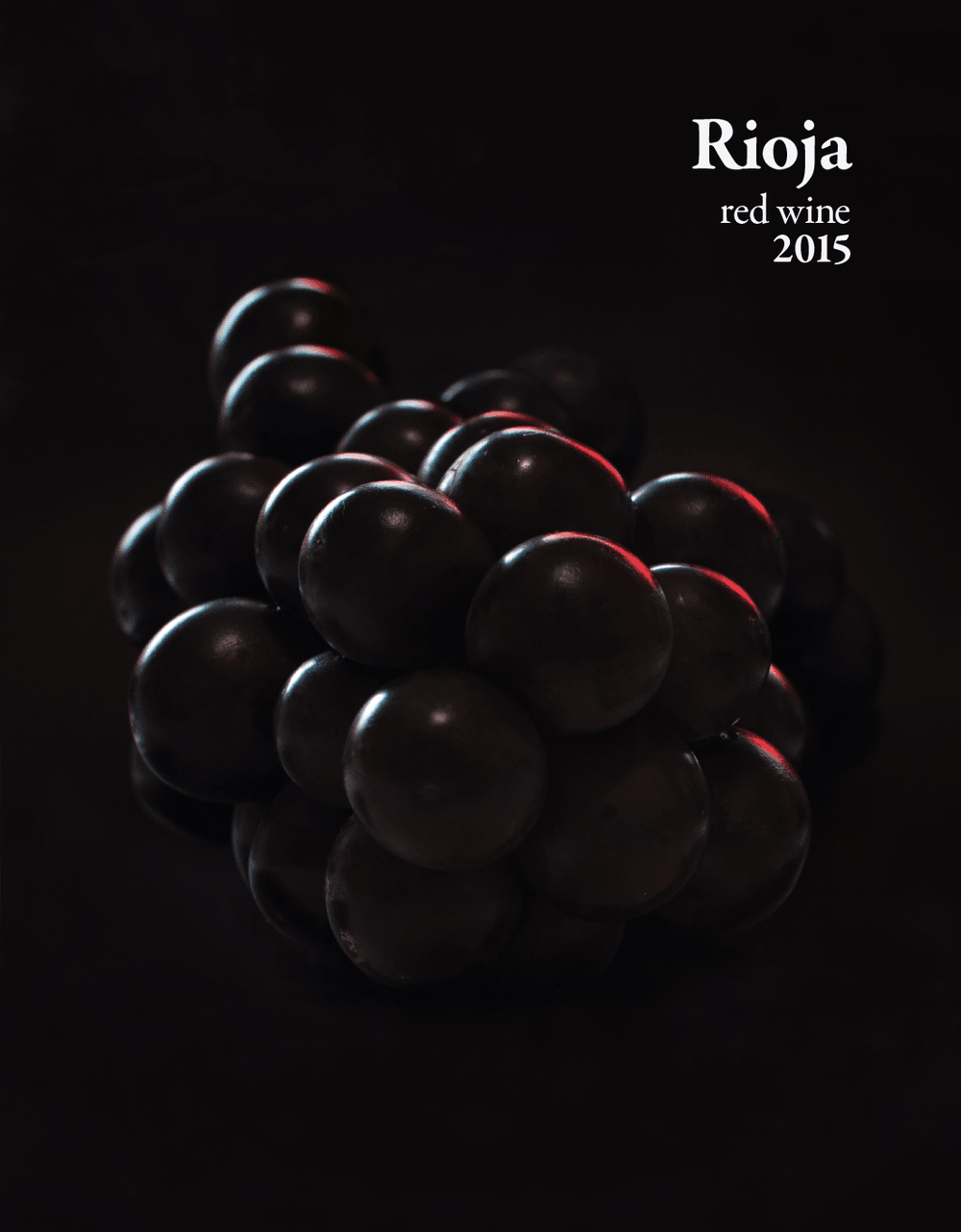
Red Rioja
The tone the handler aimed for with this wine was a serious and classic one.
This resonated with me during the tasting — said to be similar to Cabernet Sauvignon, the adjectives I used to describe its taste were deep, multi-layered and dark.

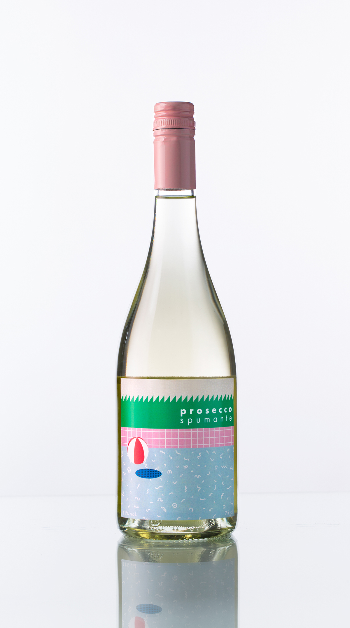

Prosecco Spumante
Fittingly for Prosecco, this label was to feel celebratory, light and sweet.
I wanted to keep the design modern and trendy, and to stay true to the aforementioned keywords without crossing over to kitsch territory.


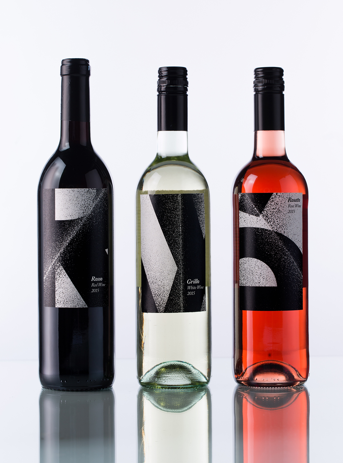
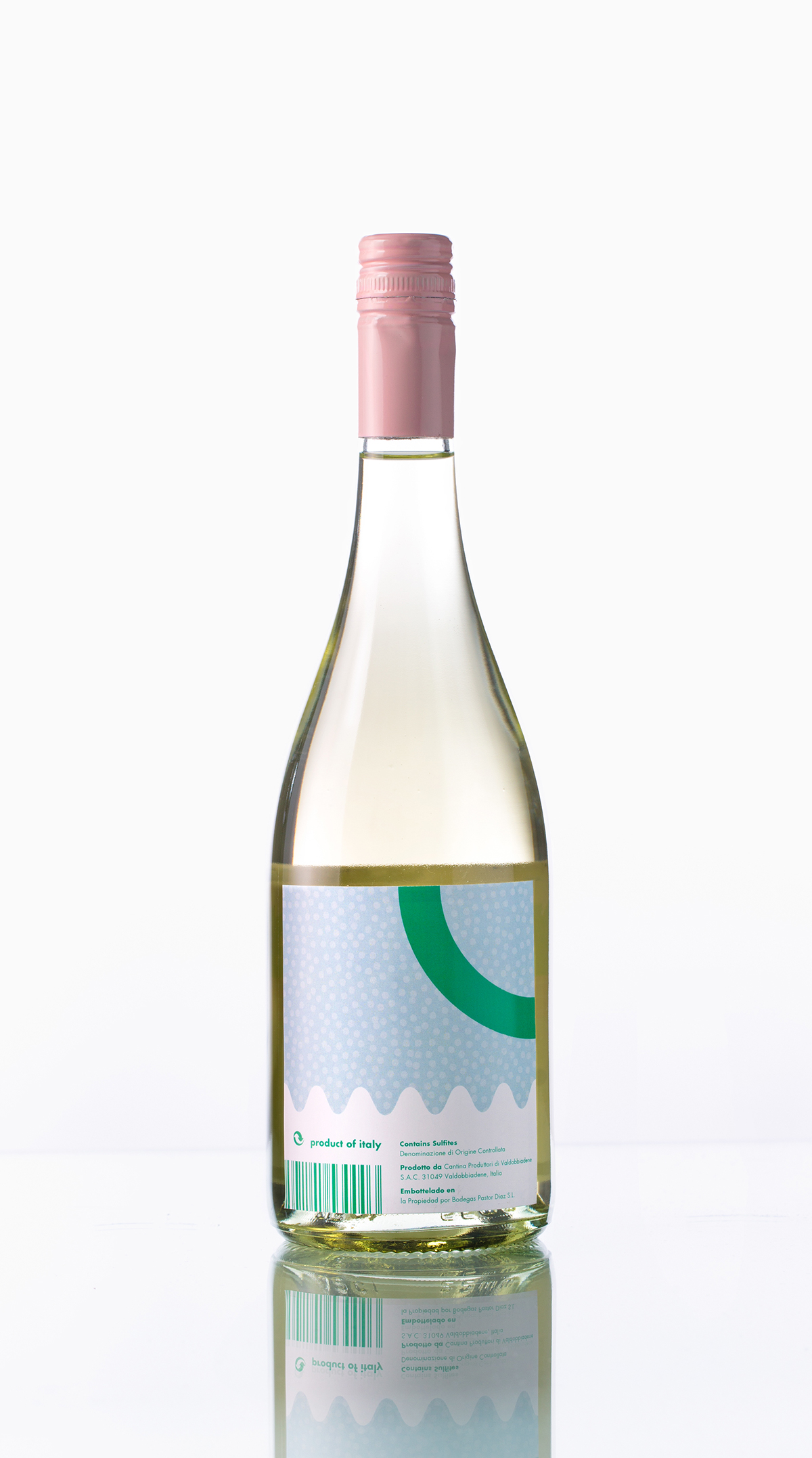
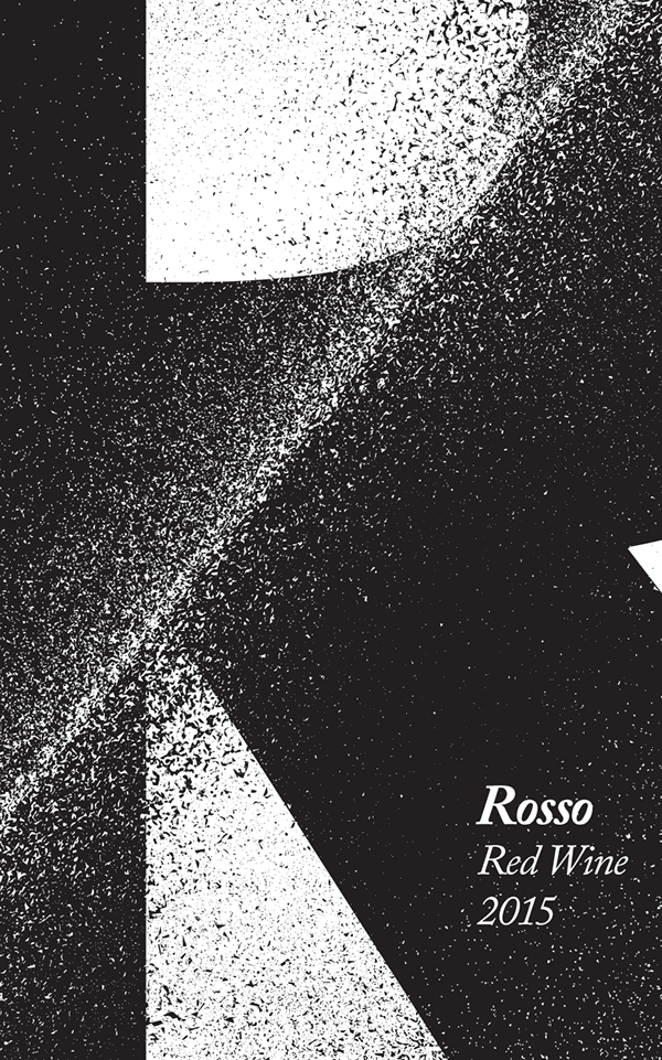
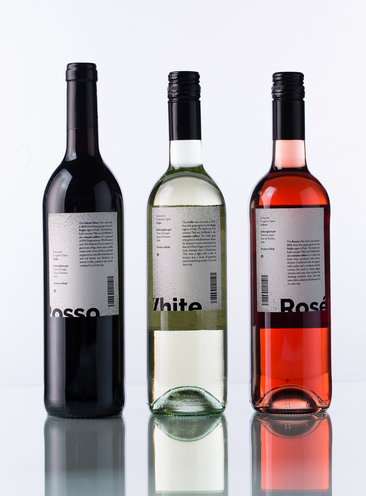
Wine series
This series was to compete with wines that had a classical-yet-modern look and feel.

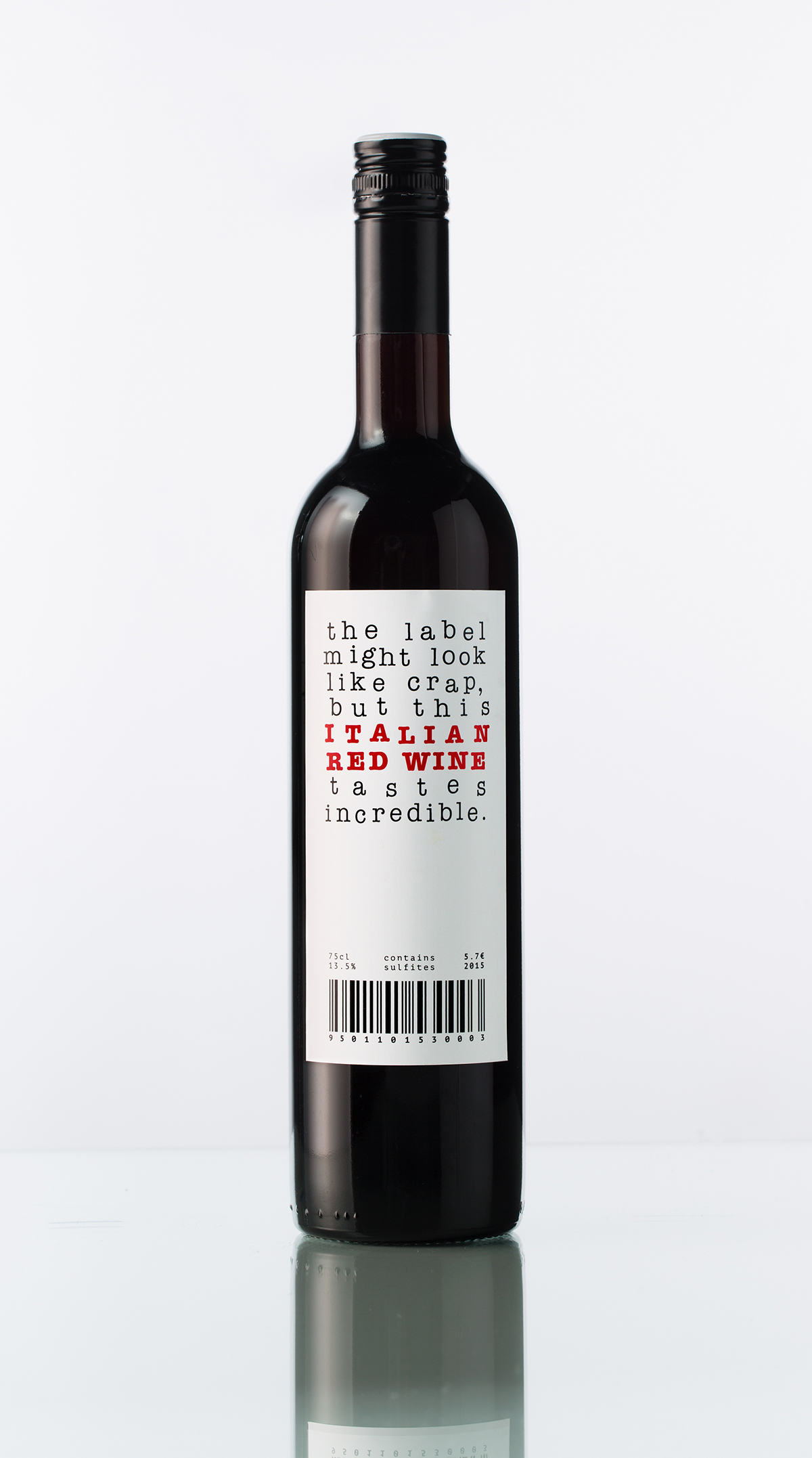
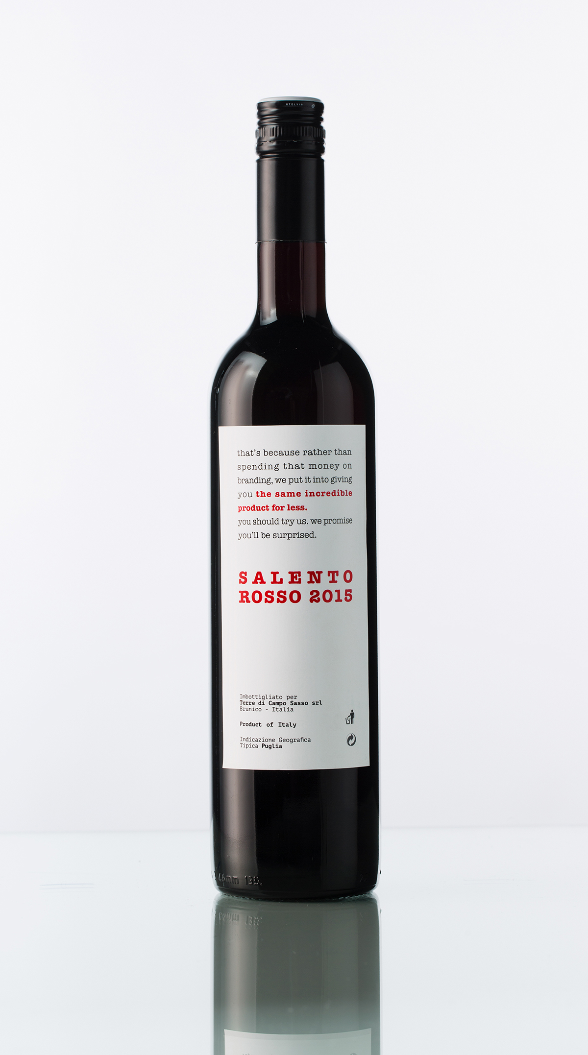
Salento Rosso
This handler wanted this label was to be cheek-in-tongue — “crazy” and young. I decided to tell the wine’s story like it is: though it’s sold for a low price, it’s actually quite good.
The label I designed for this wine was bought for use by the handler.
The label I designed for this wine was bought for use by the handler.