Kastel
Identity for a gender-equal hardware storeBrief
Choose a blue-collar shop in your neighborhood and brand it (within 3 weeks), setting it apart from others in its category.
Disciplines
Concept, photography, graphic design, identity design
Choose a blue-collar shop in your neighborhood and brand it (within 3 weeks), setting it apart from others in its category.
Disciplines
Concept, photography, graphic design, identity design
What sets apart one hardware store from another? Good service is important, but hardly a unique selling point in the field. Equal service to all genders certainly is.
Household hardware is usually a very masculine business. People who repair things are expected to be repairmen and to perform as such. Experience has taught my friends and I that if we walk into a hardware store, we'll probably receive some patronizing comments doubting our competence alongside the service we came for.
David Kastel
was different.
David Kastel
was different.
During an observation in his shop, I noticed how people's perfomed masculinity (or lack thereof) didn't change how he was interacting with them — he was giving all genders equal service.
In a business that’s perceived as hyper-masculine, that’s something to go on.
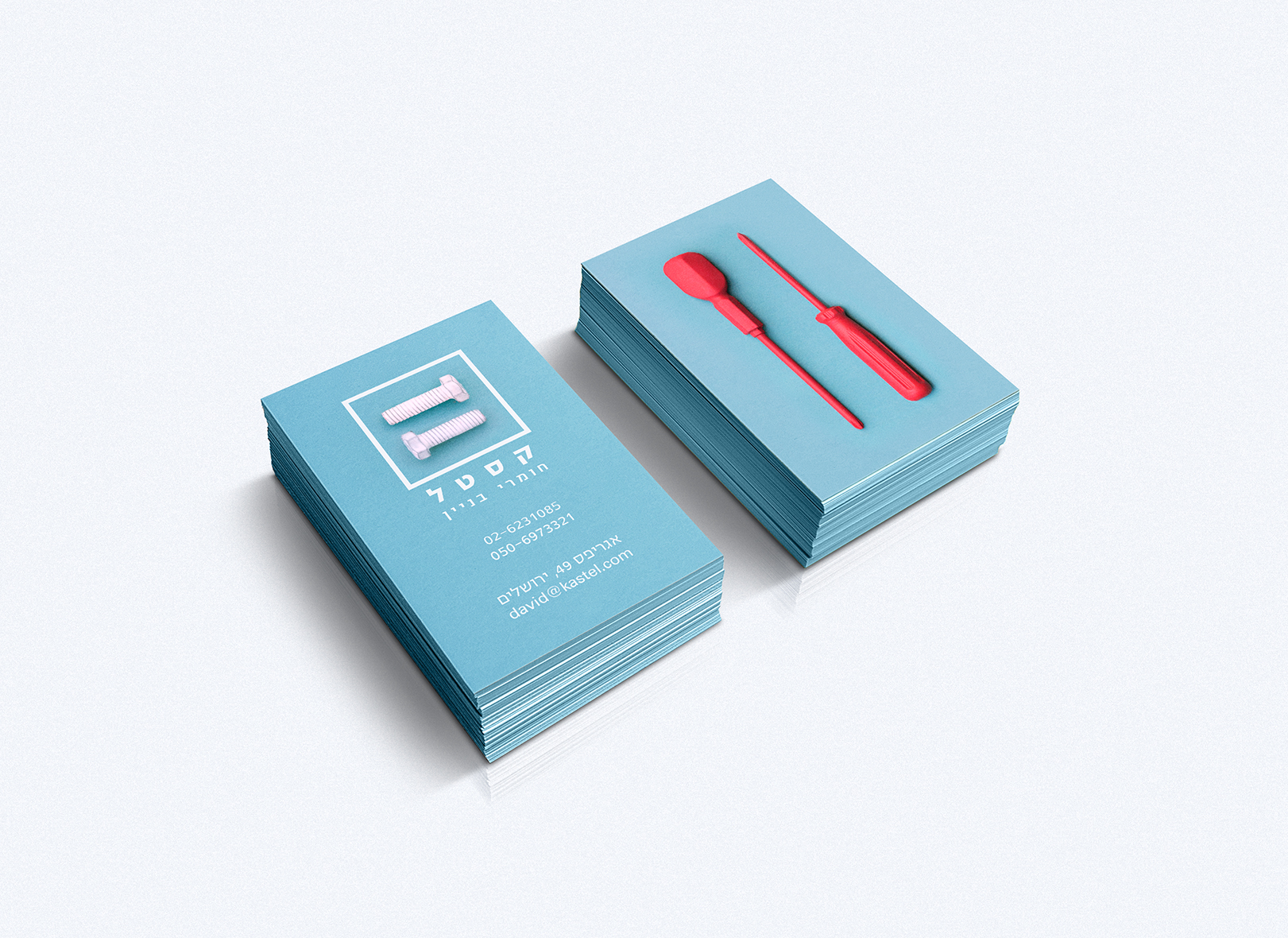
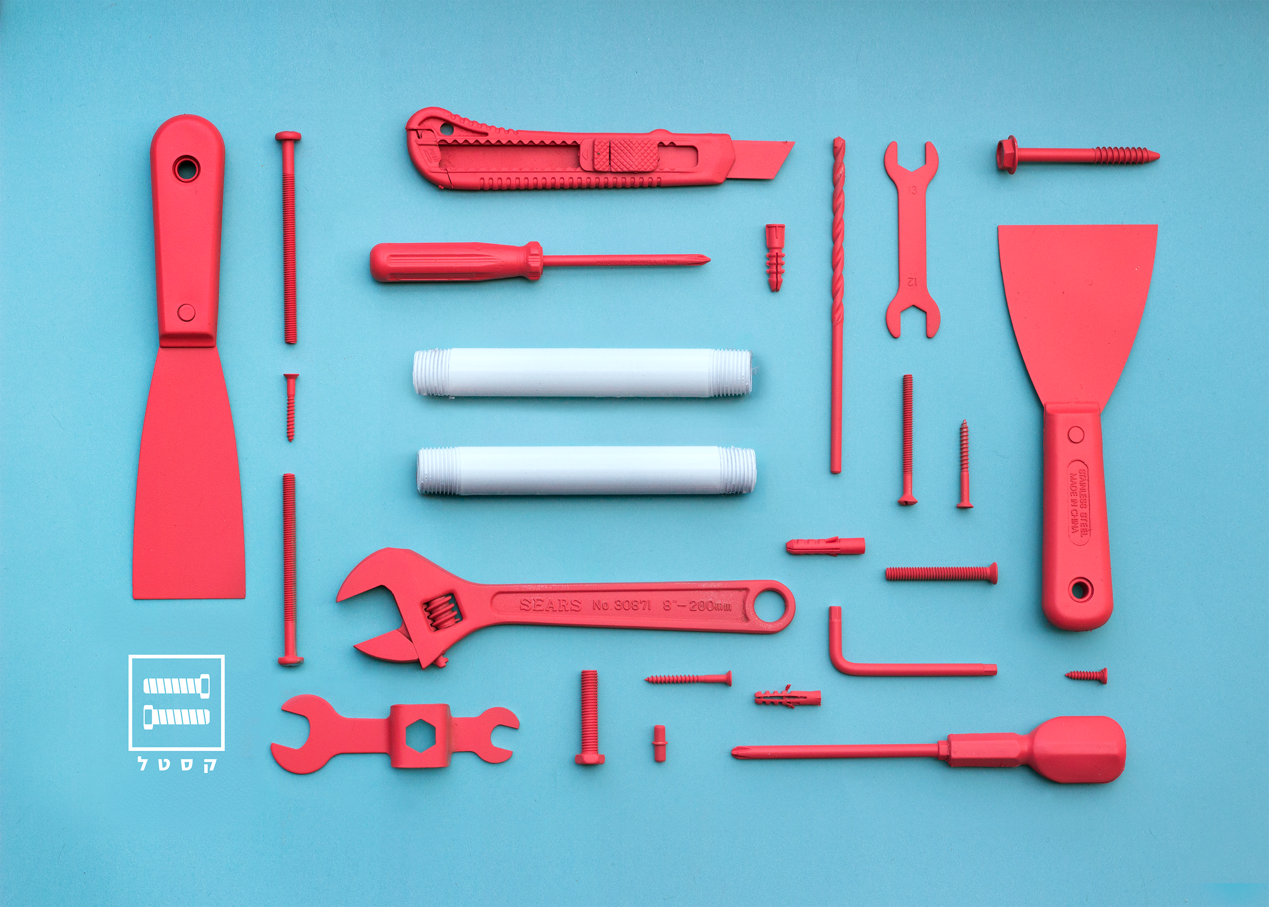
The equals sign
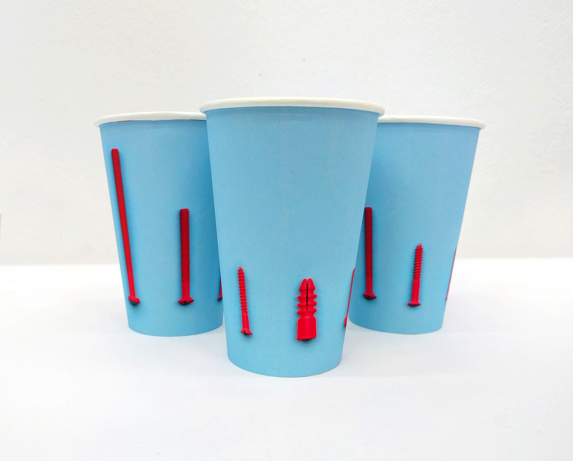
is used as inspiration for the logo, then echoed throughout the project's photographic language.Colors used
refer to the age-old cliché “blue for boys’ toys, pink for girls” cliché without conforming to it.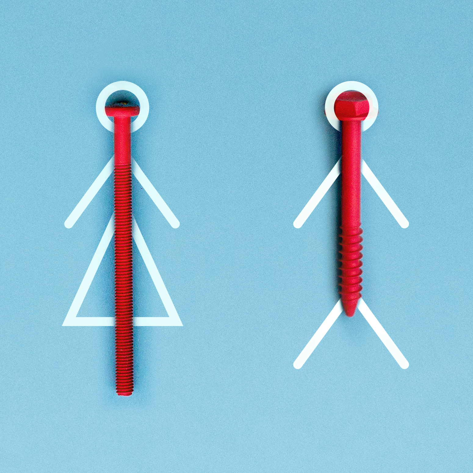
Having had more time, I would have gone further with 3D/2D combinations, as seen in the bathroom signage.